Review: Natracare Organic Cotton Panty Liners


The eco-friendly period conversation continues, this time about the ever-essential panty liner. It's only natural to consider the environmental costs of a product one uses every single day. When I ran out of liners unexpectedly, I didn't go to Walgreens due to traffic and roadside construction (for my old go-to for liners, which admittedly were of synthetic material). Instead, I went to my local health foods market, hoping they had the style I liked—lo and behold, they did... but only in this brand! I don't think I can go back to using synthetic panty liners, and here's why.


I never thought I'd be staging a photoshoot for panty liners, and yet, here we are...


You might feel more comfortable down there after
switching to organic cotton liners (via natracare.com)
Many conventional panty liners are made of synthetic material. On many of their advertising websites, the product labels are undisclosed—and whenever posed with the question, "What are your panty liners made of?" it's always met with vague answers. They carefully opt out the word 'cotton' because, ultimately, what is used are synthetic fabrics and unnecessary additives.

What's also alarming is plastic packaging that's used for panty liners: especially individually-wrapped ones, in which outside plastic wrapping holds it compactly. Users can go through two or more per day, so the amount of plastic waste thrown away adds up very quickly for one person—even in the span of a month.

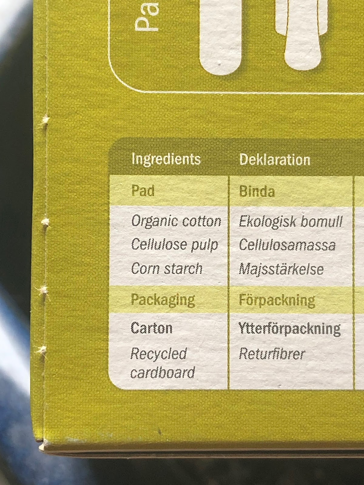
In contrast to many big-name sanitary napkin brands, Natracare is environmentally-oriented. It has cardboard packaging, and does not have extra wrapping besides the sticky side's paper backing. Their company slogan, "healthier by nature," is followed by, "organic cotton cover... plastic free, perfume free, and chlorine free" on the box. Their claims are backed incredible transparency of their product label; it's all over the box! There's absolutely no way you can miss it. There's an illustration, which sports an ingredients list in several languages.

The best news is that they source sustainably: see this page explaining how 100% certified organic cotton is more ethical and eco-friendly than non-organic cotton. Additionally, they explain how their pads are constructed and where the inner material comes from:
We use certified organic cotton for the top sheet [and] ecologically certified wood pulp as the absorbent core because the fibre chemistry is well suited for pads... Natracare uses only fluff pulp made from fast growing, Scandinavian softwood trees sourced from sustainable, managed, natural forests.


A list of ingredients puts me somewhat at ease about using
using their products and each time I throw one away.
Besides its lesser environmental impact, there are also personal benefits to using organic cotton panty liners. Those with skin sensitivities should steer clear of synthetic products meant for this delicate area due to fiber quality and processing. Chlorine bleaching and low fiber breathability, as synthetic materials often have, only encourages the development of uncomfortable skin conditions that produce itchiness and discomfort. It may also exacerbate yeast infections, which thrive on damp environments. I found that Natracare's organic cotton is significantly more breathable than my old brand; there's less sweat and heat trapped down there.

One downside to buying organic cotton is the cost. They cost more to produce so they will cost more per liner: while a box of organic cotton panty liners may be priced similarly to the big-name brands, it will have fewer panty liners per box. For example, Natracare's box has 30 panty-liners while my old brand had a 49-count per box, even though they cost about the same. The quantity difference of natural vs. synthetic liners means going through the organic cotton boxes at a much faster rate.


Anyone who wears these types of undies above has likely
struggled with a stuck panty liner... (via depositphotos.com)
Another downside of Natracare's panty liners specifically (but not exclusively—I haven't tried any other brands yet to see if it's a consistent feature in organic cotton liners): it rips apart easily when  it's even the slightest bit damp. You have to be careful removing them, because pulling directly on the topmost area splits it easily at the part where the secured wings are.

The good news is that, while very adhesive, Natracare's backing doesn't bind strongly to itself. It's surprisingly easy to separate the wings when they get stuck together (on the underside of your knickers). This contrasts with my old brand which never, ever ripped in two but sported adhesive so strong that I've actually torn and ruined a pair of undies trying to remove them.

It may be a bit inconvenient to put some extra care of removing Natracare's liners, but in actuality this isn't so bad compared to when I'd have to strong-arm my old brand's soiled panty liner off my underwear.

4.0 out of 5 stars


(via playsafe.sk)

I quite like Natracare's panty liners, despite ripping easily upon removal. I experience less moisture and sweat when wearing them, and their adhesive backing is sticky enough to stay in place without gluing the two wings together for eternity. Both width and lengthwise, it fits perfectly on my size Small underwear at 16cm long (or 6.3 inches), although another online reviewer said these were a bit small for their liking.

Overall, I don't see why I should stop using Natracare's panty liners... unless another organic cotton liner brand came along that didn't easily tear apart. If you have tried out other similar brands, drop a comment below! Thanks for reading, and may your panty liners never get stuck to your underwear.

Review: City & Premium Notebooks by Minimalism Art


My bullet journal starts in July, which is approaching fast! I'm trying to minimize purchases and am using any opportunity to save money. Though content with my current one, I do like changing it up... So, I bought Minimalism Art's City Edition Journal on Amazon. I also had the opportunity to try their Premium Journal when they offered to send it to me after I'd joined their mailing list. Here is an honest review of the two journals.


PLEASE NOTE: Images may look a bit dark, as they've been left unaltered to reflect the true colors and opacity of the pages. I tried taking these photos in the best natural lighting I had available.


While structurally similar, they're also very different.
First, the specs of these two specific journals by Minimalism Art (abbreviated as MA in this post). The underlined features point out their differences!


Premium Edition (Pink)
  • White, 120gsm, 240 numbered pages
  • 1 page (double-sided) Table of Contents
  • 2 bookmarks, pink & white w/ gold trim
  • A5 size, with Pink elastic closure strap
  • White flyleafs and expandable pocket
  • Hardcover leatherette gold logo design

City Edition (San Francisco)
  • Ivory, 120gsm, 234 numbered pages
  • 1 page (double-sided) Table of Contents
  • 1 bookmark, plain white
  • A5 size, with Brown elastic closure strap
  • Art-print flyleafs and expandable pocket
  • Hardcover linen art-print design


I love the San Francisco artwork for MA's City Journal! It has a wrap-around design, but there are no repeated landmarks.
The brown elastic strap fits the color scheme & looks chic against the white background and little specks of greenery.  

Miscellaneous Features


Only 1 bookmark in the City Journal! I rarely use it, anyhow...

The City Notebook's cover looks exquisite: the linen's understated metallic sheen is pleasing to the eye. Inside, the flyleafs display matching artwork for continuity. The Premium notebook's leatherette cover is nice to touch, it's a smidge thicker, more protective, than the other.

An expandable pocket concludes both journals and they're surprisingly generous at ~2cm at the widest. The expanding flap is dual-layered with paper on the inside, and a textured fabric-like material on the outside; it's sturdier than other journals' pockets I've felt. I won't worry about ripping the pockets out accidentally.

Another common feature between both journals is a Table of Contents, which I've found somewhat lacking with only 1 double-sided page (two pages).

I was somewhat disappointed, but not necessarily surprised; many other journals around this price range, between $12~$15 USD, do not include a TOC or numbered pages at all—MA's Premium & City Edition Journals have both.

No matter how limited, I'm glad that this budget-friendly journal includes a built-in TOC... although, I'd love if they offered more pages for it in future journals. *hint~hint*

So far, I love all of these features. But most importantly, how is the page quality?


What page belies this adorable, San Francisco-inspired artwork? Owners can write their names and addresses on this
front endpaper... however, for safety reasons, one should always write an email address instead of physical address!!


Page Quality


As I've described previously, the Premium has true white pages while the City has ivory pages (above photo). The above picture is slightly bit dark but in the next few photos, you can see a true reflection of the City's ivory pages. 


You can very clearly read 'test page' written on the
Premium Notebook from the backside of the page!


Using Crayola Supertips, I tested the same three colors. You can see that the City's ghosts less than the Premium's. The Premium papers are thick to prevent bleeding, but they seem to be rather opaque and transparent. Similar reviews on Amazon report the same thing for the Premium Notebook.

It may appear that the City ghosts badly too, but it looks extreme due to lighting. See the photo below comparing the City's paper quality (right) to Rhodia's Goalbook (left).


Compared to Rhodia Goalbook, MA's City Edition ghosts less and is brighter than Rhodia's creamy 90gsm paper. I liked the Goalbook's generous TOC and layouts, but the paper's opacity and very yellow tint have bothered me while using it.

While I'm rather happy with City's notebook's pages—and I'll be using the San Francisco edition come July—I was curious why the Premium didn't have the same paper! I took to asking customer service: Will future Premium notebooks switch over to the same paper as the City's?

This was their answer below:


Hopefully, by the end of next month, their Premium Notebooks will have the same quality paper—although it may take some time for Amazon to sell out of older notebooks. Amazon may or may not distinguish if the items in the listing are the old or new version, so be wary that you might get sent the old version.


Another page quality factor to be considered is the dot alignment. Most of the pages have very similar alignments... a small fraction do not.

The space between the very last row of dots to the pages edge on either left or right sides varies somewhat—note that they are all perfectly aligned vertically. Variation ranges between 0.4cm and as little 0.15cm from the page edge.

Most pages are consistently around the 0.35cm-mark for me to use this journal regardless, but there are a few pages (~10, give or take) that are very close to the edge. This is enough for me to raise it as a concern with Minimalism Art's paper supplier and/or quality control.

4.5 out of 5 Stars


I’ll certainly enjoy using Minimalism Art's
City Notebook throughout the next year!
Minimalism Art's City Notebook is near perfection. I'm glad to have found a journal that addressed all my needs right now: numbered, light-ivory colored pages, very little ghosting, and budget-friendly. It has its faults, which may be considered grievous for some... this includes inconsistent dot alignment, a small Table of Contents, and the ghosting it shows, even at 120gsm. Personally, I don't mind it at all when the San Francisco City Notebook is so inexpensive, at only $11.95 (at the time of my purchase).

The (old version) Premium Notebook gets docked down to 2.0 out of 5 stars, and this is for its see-through white pages alone. However, the new batches of Premium Journals will include the same paper as the City's from now on. After this transition, I gladly bump it back up to 4.5 stars.

Would I buy this journal again? Maybe! If my two main issues are addressed in future versions of this journal—the slight differences of dot alignment and small table of contents—I'd definitely continue purchasing Minimalism Art’s products as my staple bullet journal brand.